UX design · Concept · 2026
Stagewise
A concept for planning self-organized multi-day hikes, where route, daily stages and huts live on one map and a booked-out hut no longer sends the whole plan back to the start.
UX design · Concept · 2026
A concept for planning self-organized multi-day hikes, where route, daily stages and huts live on one map and a booked-out hut no longer sends the whole plan back to the start.
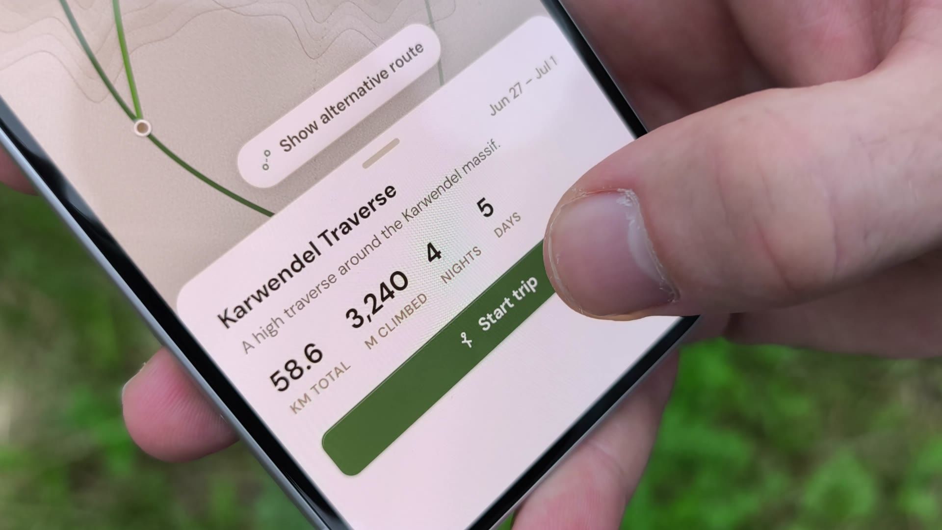
Three decisions that depend on each other, spread across tools that don't.
Anyone planning their own multi-day hike on fixed dates has to keep three things in balance: a route that works across several days, daily stages that are actually walkable, and a bed on the right night at the end of each one. Route apps know the terrain but not the beds. Hut portals know the beds but not the route. Some huts still only answer by e-mail.
So the decisions get made in isolation, and a single booked-out hut can push the whole plan back to the start. With Alpine huts busier every season, that happens more and more often.
One hiker's workflow, mapped closely enough to see where it breaks.
The project is built around a real person, "John": an experienced hiker in his early thirties who plans three to five multi-day trips a year on his own. A long interview about how he plans a trip end to end became a task analysis: pick a route, gather information, split it into stages, find a bed for each, and only commit once everything holds.
That model exposed the fragile moment. When one stage loses its hut, the replacement sits somewhere else, so the distance and difficulty of the neighbouring days shift too, and the problem ripples outward. A look at Komoot, Outdooractive and the hut portals confirmed that each covers part of the picture, but none sits where route, stages and accommodation meet.
The hard part isn't planning. It's recovering.
Three findings shaped the concept. The three planning scopes are truly interdependent, so a choice in one can quietly break another. The most painful moment is the recovery after a lost booking, not the first draft. And availability shows up far too late, usually only when a booking is attempted, so time gets sunk into stages that then have to be redone.
The need was never faster routing. It was keeping linked decisions visible and easy to adapt, in one place.
One map, three lenses, and conflicts that turn into editable re-routes.
You set your preferences once: start, an optional end point and trip length, plus a few filters for difficulty and accommodation. Leave the end blank and the trip grows hut by hut; fill it in and a complete route is proposed for refining. It's the same flow either way, with no modes to choose.
Planning then happens on a single map seen through three lenses. Overview shows the route's shape, Huts brings accommodation forward colour-coded by availability, and Day view drops into one stage to fine-tune its path. Each lens holds back what the others emphasise, so dense information stays readable. Fully booked huts stay on the map in red instead of vanishing. When a bed falls through, Stagewise flags it in every lens and proposes an adjusted route in the same editable form, so the plan flexes instead of collapsing.
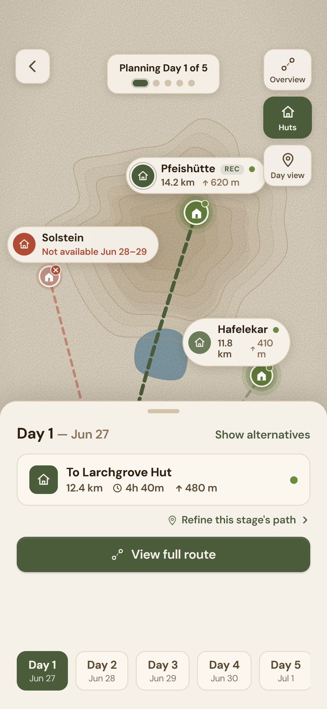
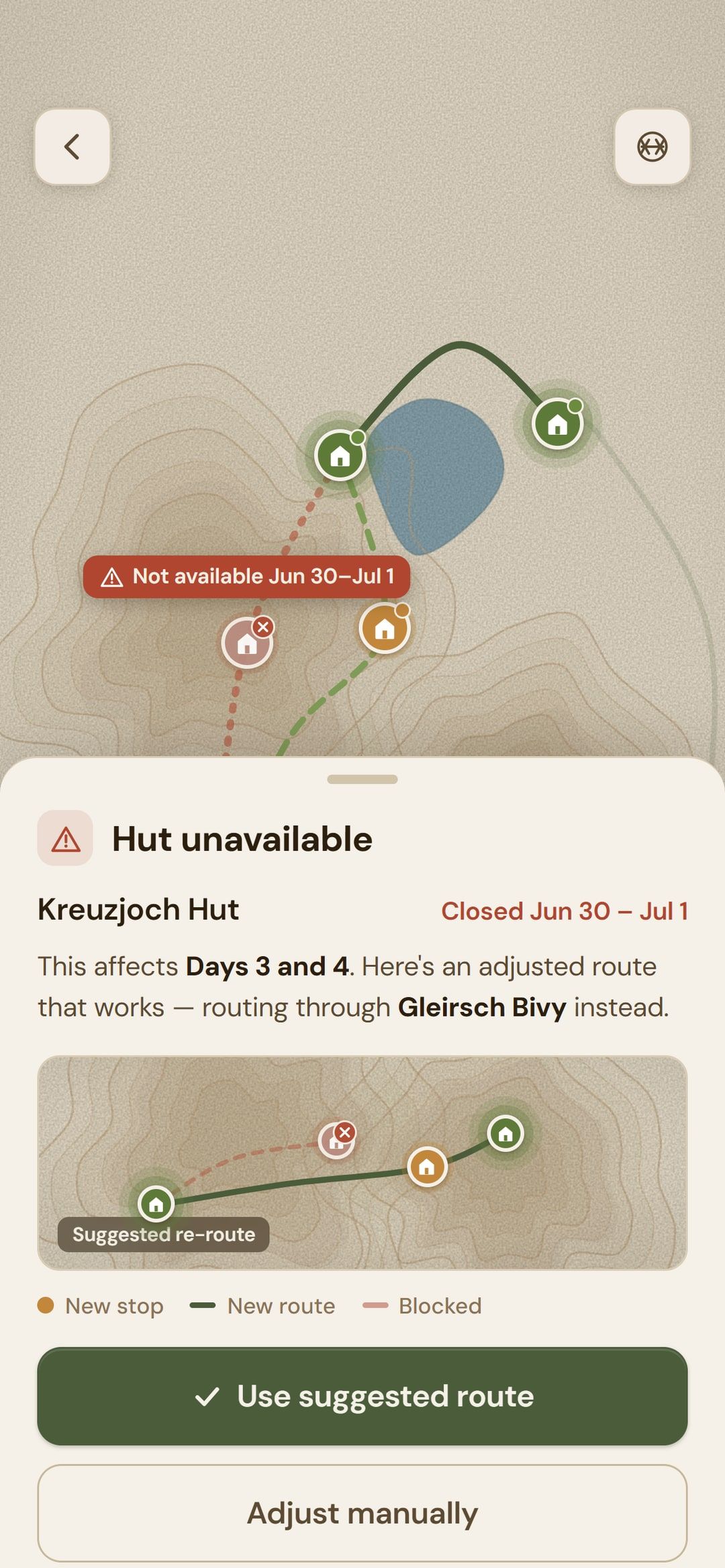
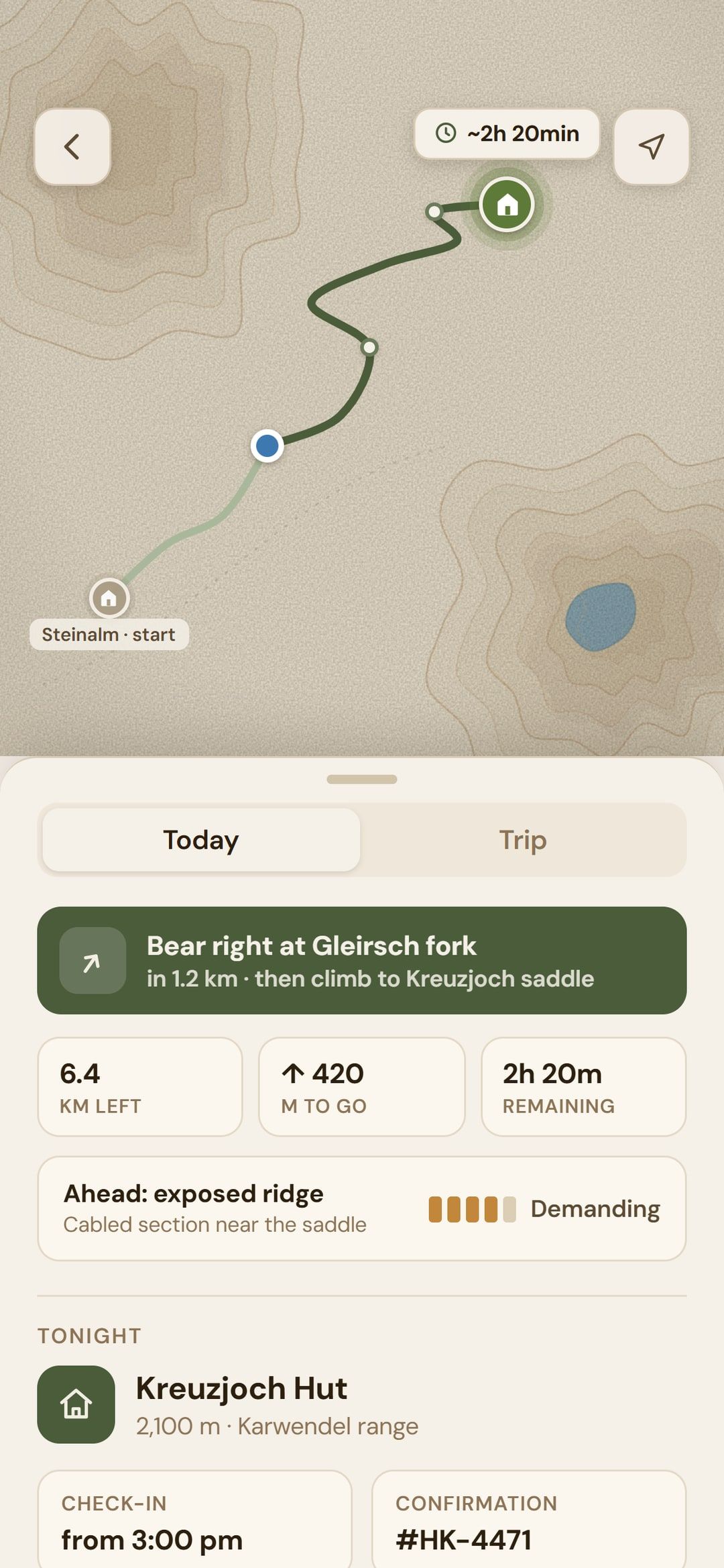
Clarity comes from what a screen chooses not to show.
Modelling the task before drawing any interface paid off: once the failure point was clear, most features followed directly from it. The screens themselves were sketched by prompting Claude Design, and a clickable prototype was built to record real on-device footage for the video.
The concept hasn't been user-tested yet. Next steps would be a hallway test of the lens model and the conflict flow, designing the edge cases where filters can't all be met, and giving the on-trail companion the attention it deserves.
A joined-up way to plan a hut-to-hut trip that can absorb change.
The clickable prototype was built to film the concept video and is best viewed on a phone.